Washi: An origami teaching app
Washi grew out of my frustrations as a long-time origami folder. Origami instructions were imprecise and difficult to follow, resulting in a steep learning curve to go from "beginner" to "advanced.” My design smooths that curve and supports new origami learners.

Udacity Nanodegree. Role: UX Designer. 2022.
Skills: Figma, Miro, Zeplin, User testing, User interviews, A/B testing, Accessibility, Design sprints, Feature prioritization.
Question: How and why do people learn to fold?
I started my design process with the knowledge that first-time folders are often alienated by the teaching conventions of the wider origami community. I wanted to investigate how a true beginner might learn, rather than attempting to use historic origami diagramming techniques. However, it was important that I understand advanced folders’ needs and wants as well, to ensure that Washi could foster an enduring community.
How did we do it?
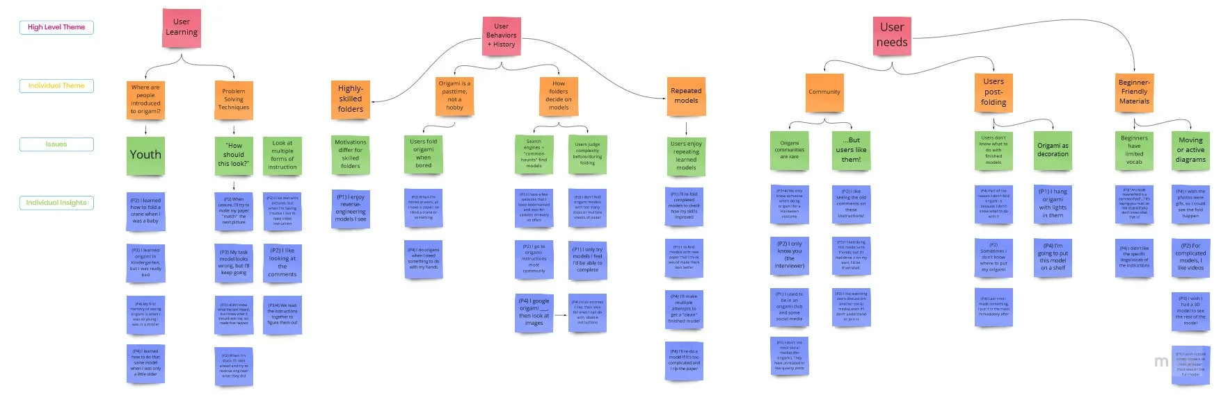
In order to learn more about beginner origami folding perspectives, I conducted a survey and semi-structured interviews. The survey investigated trends I had noticed by examining origami communities online. The semi-structured interviews took my survey results and expanded on them.
While conducting the semi-structured interviews, it was important to me to interview a mix of beginner and more advanced folders. However, complete beginners often had no recent experience with folding origami. To solve this problem, I included a brief origami folding task at the beginning of the interview. This had a few benefits:
Interviewees felt more comfortable sharing their frustrations and failures if I was folding along with them.
I could directly observe pain points that occurred within the context of a “traditional” origami instruction set.
Interviewees who had not recently folded origami were able to describe specific instances where they felt competent or struggled.
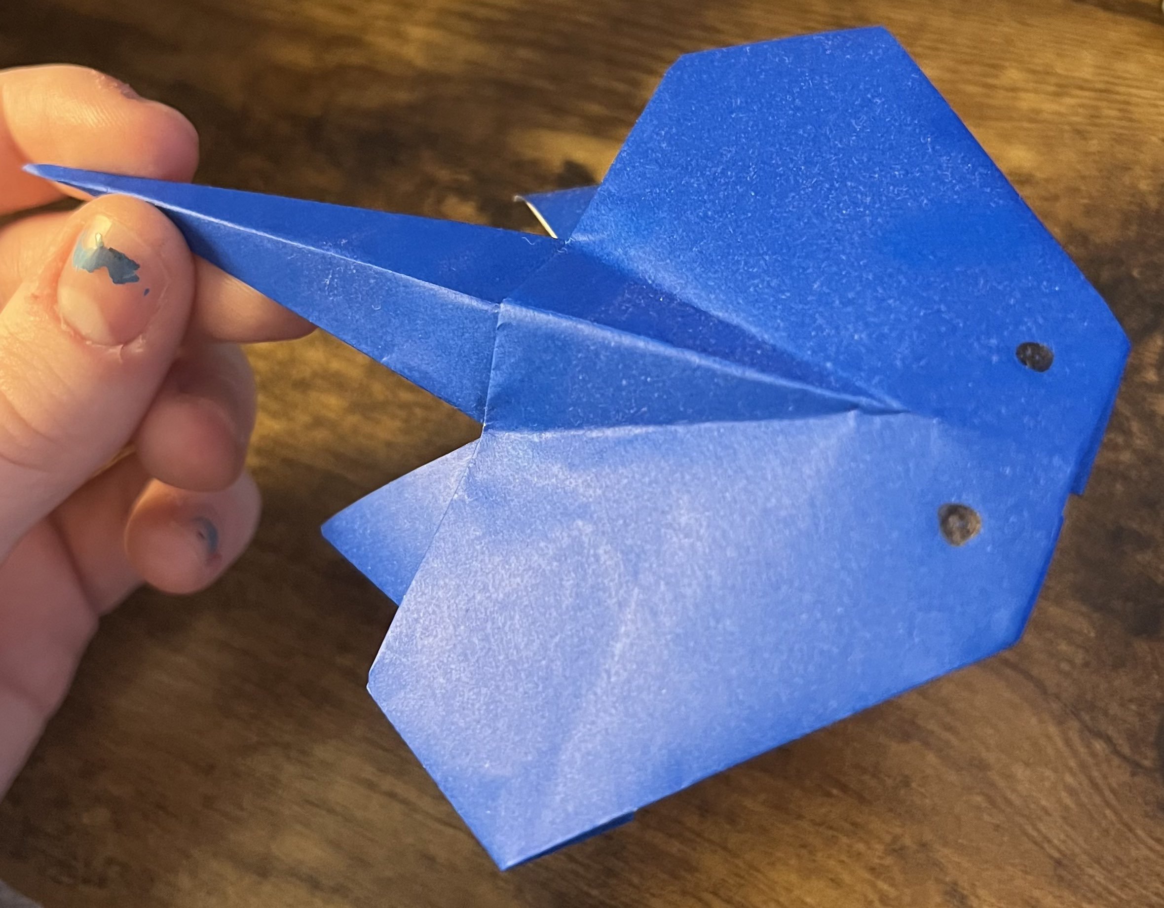
“I’d like us to fold an origami model together. I’ll give you a sheet of paper and a link to a tutorial, and we can each fold the model. It’s an intermediate model, so it may frustrate you, or you may find it easy.”
How I introduced the task to users, pictured with one of my interviewee’s completed models.
What did we learn?
My primary finding was that beginner and advanced folders shared some common problems. Specifically, at all skill levels, folders had little interaction with a broader origami community, preferred 3D instructional forms, and struggled to find something to do with finished models. I chose to target these needs and wants in my app design.
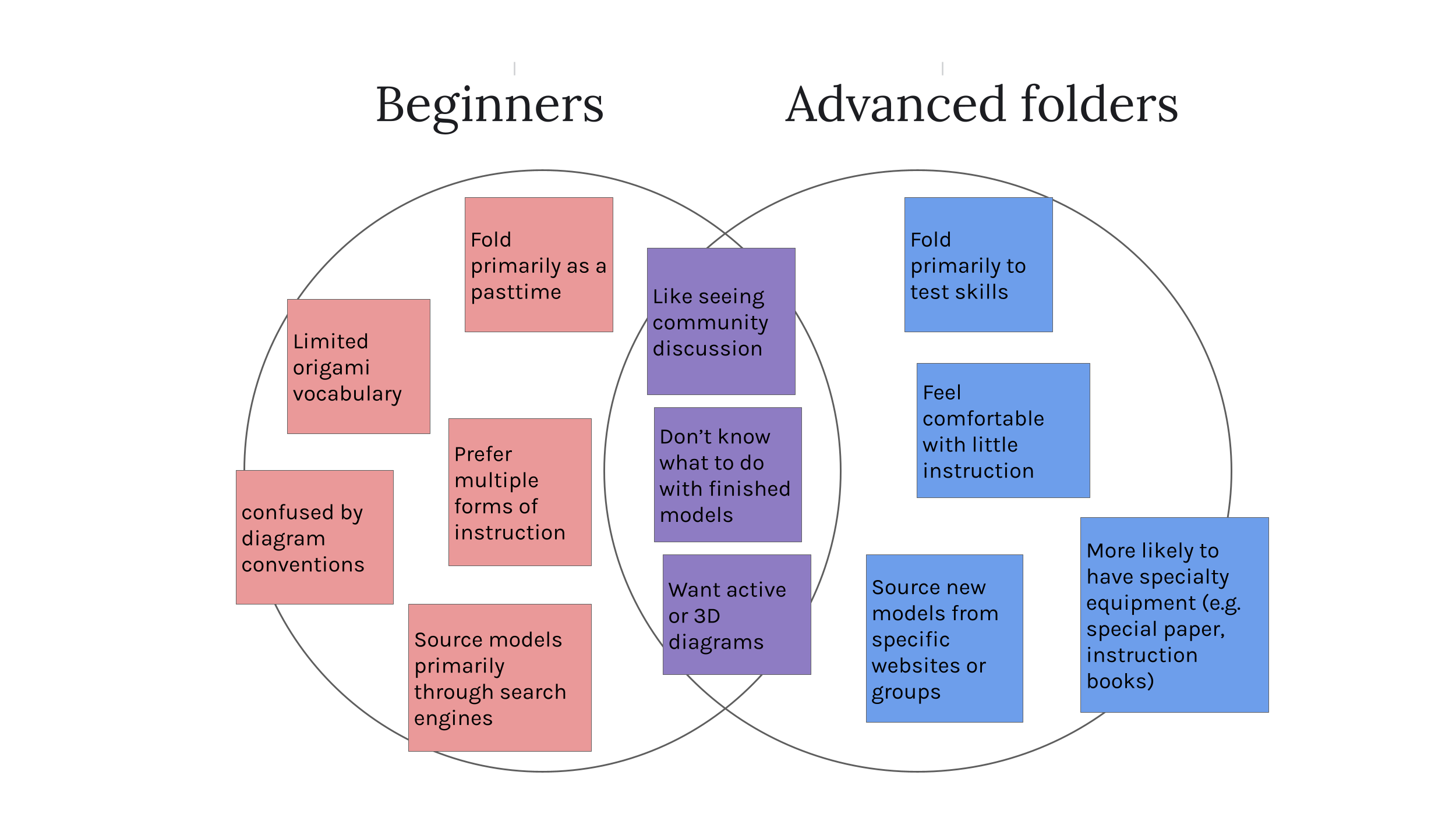
A Venn diagram of similarities and differences between beginner and advanced folders.
Research-Based Design
Due to my findings, I decided to focus on an app that taught multiple origami models in a way that encouraged community interaction. I progressed from ultra-low-fidelity sketches…

Some of the first sketches I did, Crazy-8 sketches allowed me to explore wild concepts to solve the main needs of users.
…all the way to a fully-functioning prototype. I’ve described a few of my research findings below, followed by the design decisions they inspired.
Finding: Folders use a variety of methods to understand steps.
Looking at the next step and attempting to “match” their model.
Searching out alternate instruction formats (e.g. video, text).
Investigating comments for clarification.
Goal: Allow multiple methods of instruction, so that users can “explore” the model, rather than just being instructed.
Design: Each step of a model includes multiple forms of instructions, including image, text, and a gif.
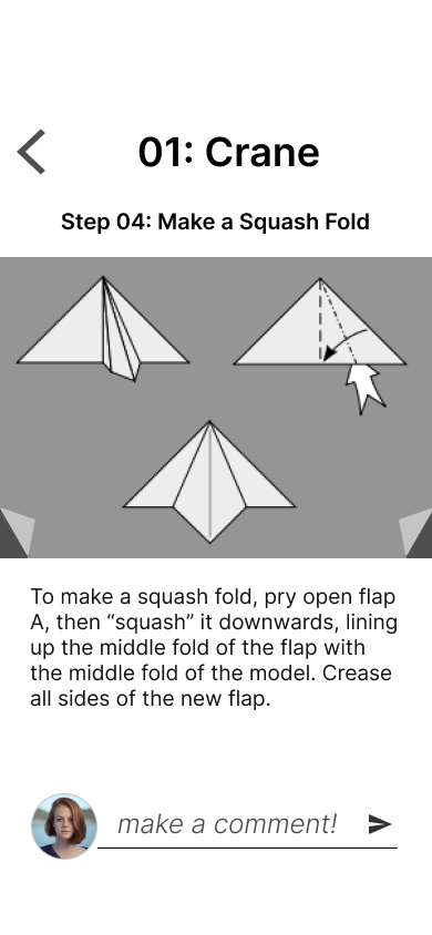
A page of instructions includes image instructions and text
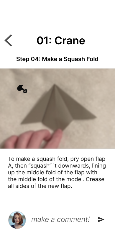
A long press activates a gif, allowing a 3D view
Finding: Folders enjoy seeing community interaction, even if they aren’t taking part in the conversation.
Community also helps with learning: “Seeing others doing a model helps me feel less frustrated.”
Folders would look to comments for help when stuck.
Goal: Allow multiple levels of community interaction, from in-depth conversation to observation.
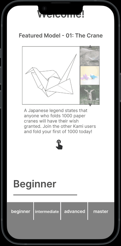
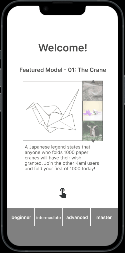
Design: Each step includes a comments section for discussion of the model, while a “featured model” section displays users’ completed models.

Washi’s home page, featuring pictures of users’ models
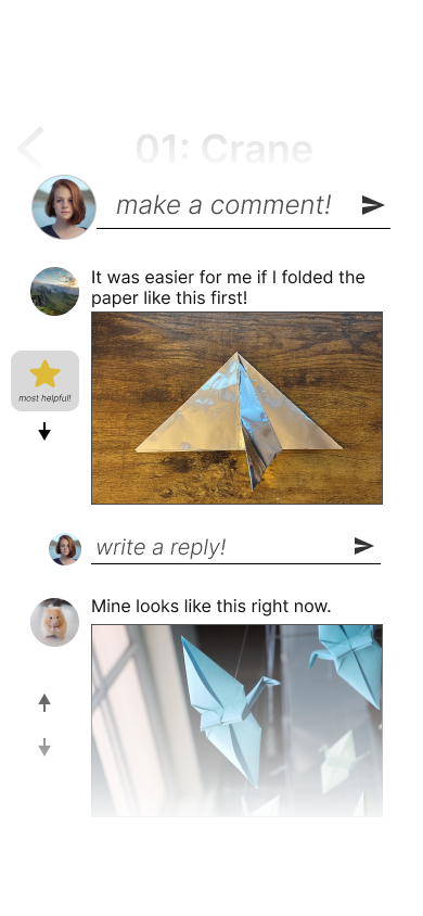
The comments section for a step of a model
Finding: Users can intuit how to move between screens, but spend too long on this process.
In a previous iteration, no animations were used, and moving between instruction steps was “instant” rather than visually distinctive.
Average time taken by new users to move between instruction steps on first try: 17.5 seconds.
Goal: Decrease time taken to move between screens when first introduced.
Design: When screens with new movements are introduced, a brief animation plays, demonstrating how to activate transitions and what that transition looks like.
After animations were implemented, the average time needed to navigate between steps was cut by over half, from 17.5 seconds to 7.25 seconds.
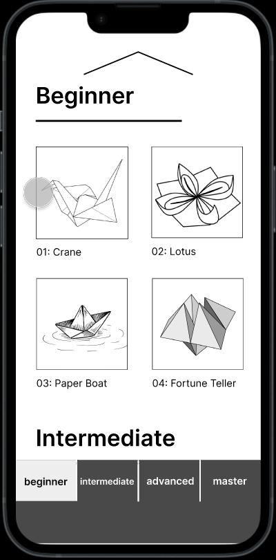
The home page instructs users to scroll to see more models
Users learn how to move between steps
Additional Iteration
WCAG Compliance
After checking for WCAG AA compliance, I realized that my design was not entirely accessible. I increased font sizes and increased the color contrast for diagram images.
Usability Testing
Usability testing discovered that users would view any part of the model selection tile as a clickable interface. I revised the prototype to allow for navigation based on clicking model select images or titles.
Usability testing also generated ideas for comment section organization. The decision to implement up/downvotes and forum-style organization was based on user discussion of valued comment features.